Geometric Philadelphia
Posted on March 23 2018
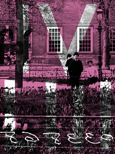
Some of the interior projects I've been working on lately have asked for historic images of Philadelphia. I wanted to give them a more contemporary twist so I've been pairing them up with strong geometric patterns and bright(ish) colors.
This is one of the first compositions (1/6) using a portion of a picture of pipe workers in 1907 around Broad and Lombard Street.
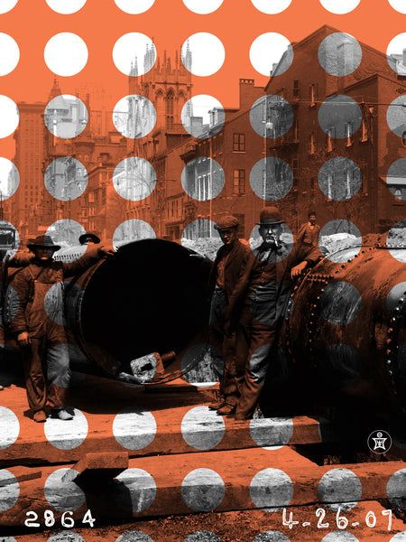
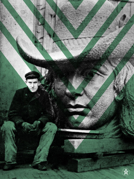
Another in this series (2/6) mixing antique photos of Philadelphia with bold colors and geometric elements is Alexander Milne Calder and the head of William Penn of which he sculpted. The sculpture was cast in fourteen sections and took almost two years to finish. It was installed on top of City Hall in 1894.
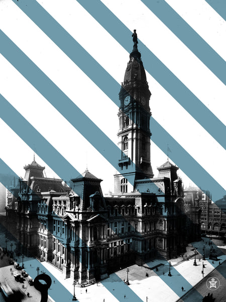
(3/6) A photo composition of City Hall Philadelphia taken somewhere between 1890 - 1910. Probably after 1894 as that is when William Penn was installed on top. It is so crazy exploring these old photos and seeing the people, the cars and life a long (not so long) time ago.
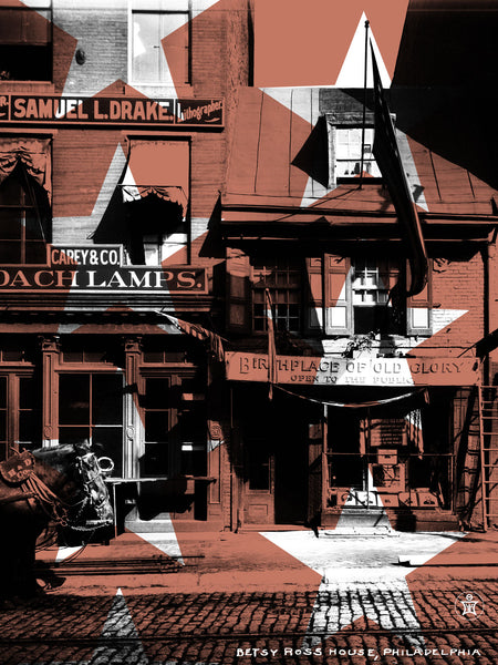
This one of the series (4/6) is of the Betsy Ross House. Taken around 1900, it says "Birthplace of Old Glory" over the doorway. Once again taking something old and making it new with a few layers of transparent screens, geometric shapes, and an off color.
I chose this section of this photograph to be included in this series (5/6) because I just loved how the gentleman and little boy, holding a stack of newspapers, were standing there staring into the camera. I could feel them looking at me. I also really liked the way they were dressed.
I wasn't sure about what geometric element to add to this one so, for now, I included the time the photo was taken as you can see the clock on Independence Hall in the full picture. The photo was taken somewhere between 1900-1910.
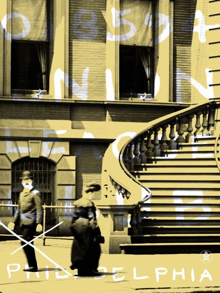
And the final (6/6-?) in this series are two people in front of the Union League Club taken around 1905. I need one more to finish this set to be presented and after going through thousands of pictures I ended up settling on this tight close up of this picture. In the original, you can see the whole building.
I was really attracted to how he was staring into the camera as if he was looking at me, the hint of his mustache and bowler hat and of course her beautiful gown. The stairs and lines of the building were already giving me geometric elements so I decided to pull from some of the writing on the original photograph and include that as the background design elements.
Thanks for following along in this series. I have worked on a couple more that I'm sure I will post in the near future when the project is complete.

Connect